Brand Identity
Case Study: The Lotus Project
June 2018
[02]
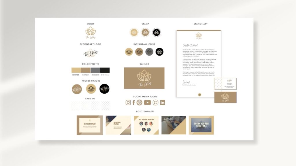
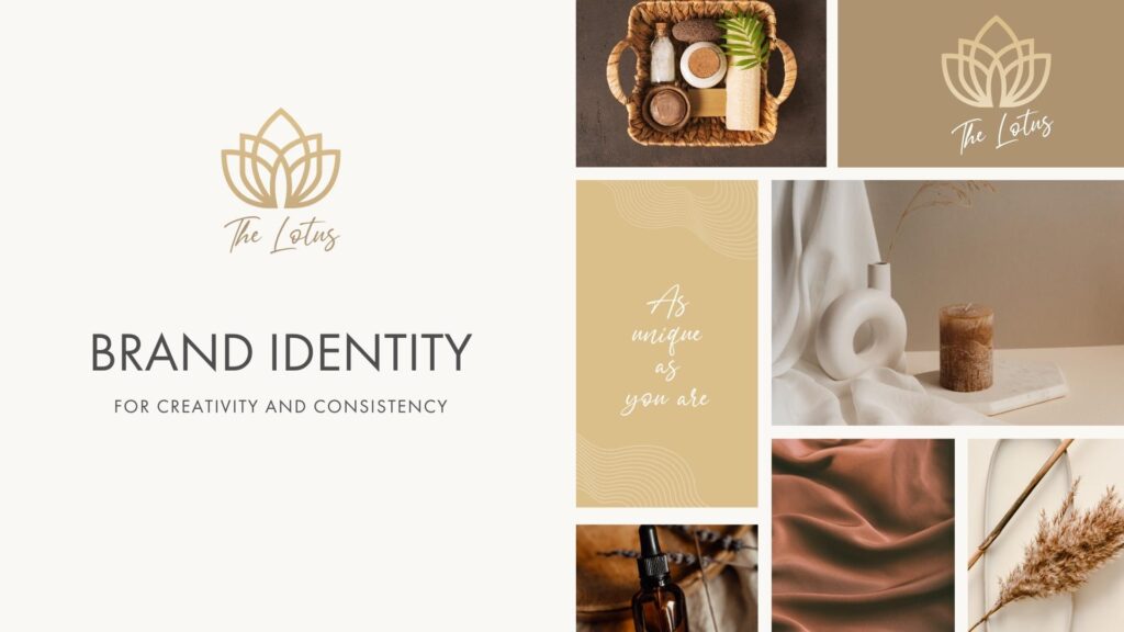
The Lotus project represents a minimalistic approach to brand identity design, seamlessly blending simplicity with the soft, earthy elegance of natural nude tones. Inspired by the lotus flower's natural beauty and resilience, this project aims to capture a timeless aesthetic that is both grounded and sophisticated.The Lotus project embodies the essence of minimalistic brand identity design, harmoniously blending simplicity with the soft, earthy elegance of natural nude tones. Inspired by the natural beauty and resilience of the lotus flower, this project captures a timeless aesthetic that is both grounded and sophisticated.
In this design, I focused on creating clean, elegant visuals that convey a sense of calm and balance. The natural nude palette adds warmth and subtlety, providing a unique and memorable brand experience. Every element, from the logo to the typography, is meticulously crafted to reflect the brand’s core values of purity, growth, and tranquility.
Objective
The goal was to develop a brand identity that embodies purity, growth, and tranquility through clean and elegant visuals. The design needed to convey a sense of calm and balance while creating a unique and memorable brand experience.
Design Approach Inspiration
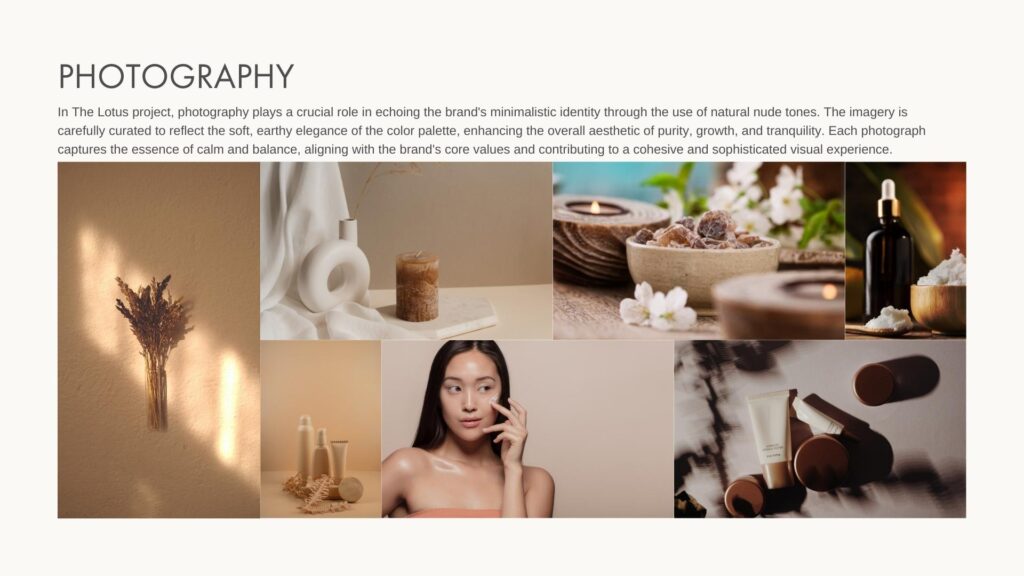
Natural Beauty: Drawing from the lotus flower, which symbolizes purity and resilience, the design incorporates natural nude tones to evoke a sense of warmth and subtlety.
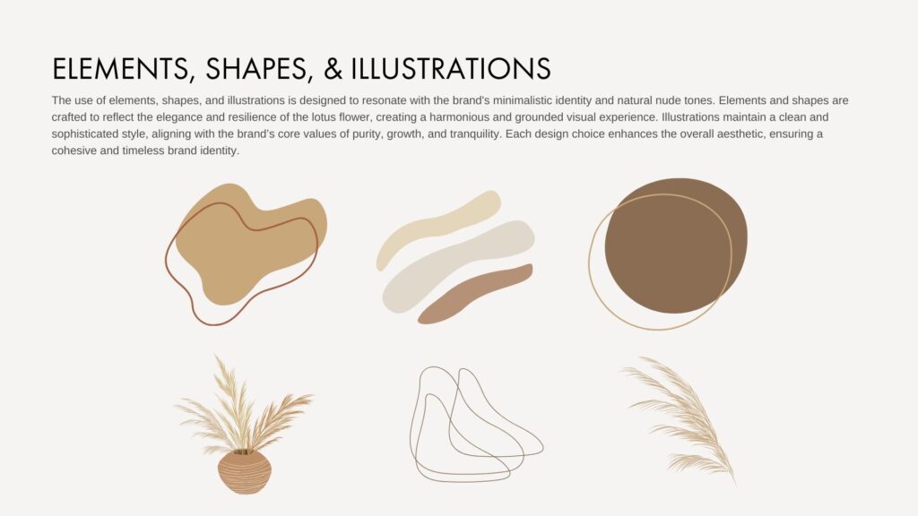
Minimalism: Emphasizing simplicity and elegance, the design approach focused on clean lines and understated visuals to create a sophisticated aesthetic.
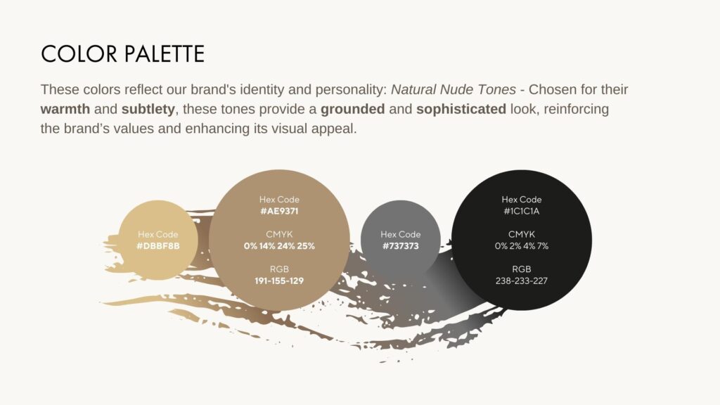
Color Palette: Natural Nude Tones - Chosen for their warmth and subtlety, these tones provide a grounded and sophisticated look, reinforcing the brand’s values and enhancing its visual appeal.
Visual Elements
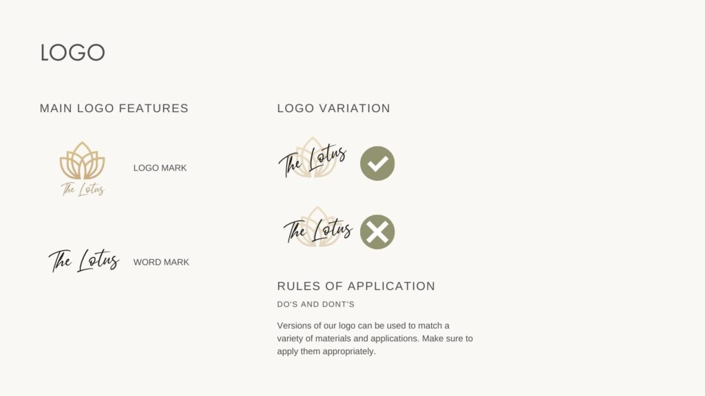
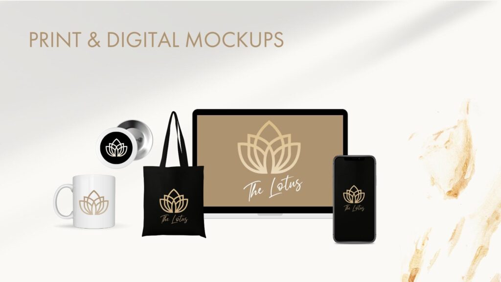
Logo Design: The logo features minimalistic and fluid shapes that reflect the lotus flower's grace and resilience. It is designed to be timeless and adaptable across various applications.
Typography: The chosen typeface complements the overall minimalistic theme, offering clarity and elegance while maintaining readability and refinement.
Overall Aesthetic
Clean and Elegant: Every design element, from the logo to the typography, was meticulously crafted to ensure a harmonious balance between simplicity and sophistication. The visuals are designed to evoke a sense of calm and tranquility, aligning with the brand’s core values.

Implementation
Brand Identity: Developed a comprehensive brand identity including logo, color palette, and typography.
Visual Consistency: Ensured that all design elements worked together cohesively to deliver a unified and memorable brand experience.
Results and Impact
Brand Perception: The minimalistic and elegant design effectively communicated the brand’s values of purity, growth, and tranquility.
Customer Feedback: The use of natural nude tones and clean visuals resonated with the target audience, enhancing brand recognition and recall.
Market Positioning: The timeless aesthetic set the brand apart in a competitive market, establishing it as a sophisticated and grounded choice for consumers seeking elegance and calm.
Conclusion
The Lotus project successfully embodies the essence of minimalistic brand identity design through its use of natural nude tones and elegant visuals. By reflecting the lotus flower's purity and resilience, the design creates a timeless and sophisticated brand experience that aligns with the core values of tranquility and growth.


 Got a project in mind? Say hi