Packaging Design
[01] Case Study: Color and Font Choices for Sustainable Supplement Brand Labels
Holi Livits - Frankfurt, Germany
April 2020
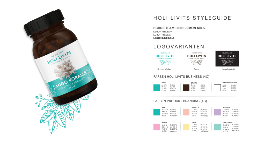
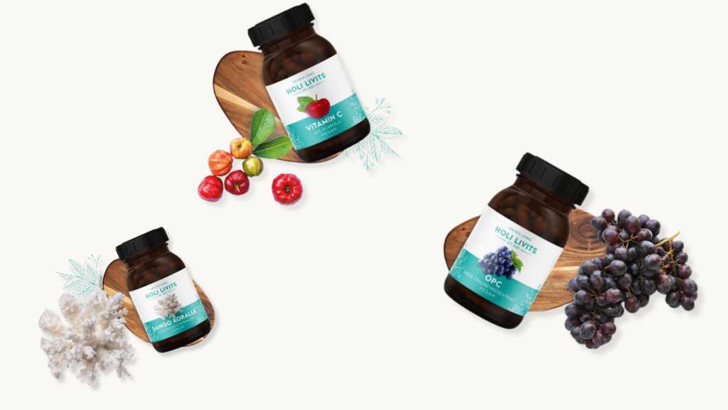
For Holi Livits, a sustainable supplement brand, the objective was to design labels that embody the brand's core values and appeal to health-conscious consumers. The chosen colors were mint and dark brown, and the font selected was Lemon Milk. These decisions were pivotal in the design of labels for their supplements: Vitamin C, Sango Koralle, and OPC.

Challenge
The primary challenge was to create label designs that:
Reflect Holi Livits’ commitment to sustainability.
Stand out in a saturated market.
Appeal aesthetically to a discerning customer base.
Research and Strategy
Comprehensive research was conducted to understand market trends, target audience preferences, and competitors.
Key findings included:
A growing consumer demand for sustainable products.
The supplement market’s prevalent use of greens and blues to denote health and nature.
Why Mint and Dark Brown?
Mint and dark brown were selected based on their strategic and psychological benefits:
Mint: Association with Nature and Freshness
Psychological Impact: Mint evokes feelings of freshness, tranquility, and renewal, aligning with the brand's sustainability ethos.
Symbolism: Represents balance and growth, essential for a brand focused on health and well-being.
Market Differentiation: While green is common, mint offers a unique, standout twist that maintains the natural association but differentiates Holi Livits from competitors.
Dark Brown: Connection to Earth and Reliability
Psychological Impact: Dark brown symbolizes earthiness, stability, and reliability, reinforcing the brand’s commitment to natural and trustworthy products.
Visual Contrast: Provides a strong, earthy contrast to the lightness of mint, creating a balanced and visually appealing label.

Why Lemon Milk Font?
The Lemon Milk font was chosen for its modern, clean, and readable qualities:
Modern and Clean Aesthetic: Its geometric style and clean lines contribute to a contemporary look, appealing to a modern audience.
Readability: Ensures clarity and ease of reading, crucial for supplement labels.
Versatility: Complements both mint and dark brown, enhancing the overall design.
Implementation
The label design for Vitamin C, Sango Koralle, and OPC supplements incorporated the following elements:
Eco-friendly Materials: Labels printed on recycled paper using soy-based inks.
Color Scheme: Mint was used as the primary background color, with dark brown for text and accents, creating a harmonious and natural look.
Font Usage: Lemon Milk was used for all text elements, ensuring a consistent and modern appearance.

Results and Impact
The introduction of the new label designs had a measurable impact on Holi Livits:
Enhanced Brand Perception: Customer surveys indicated a 40% increase in the perception of the brand as modern, eco-friendly, and trustworthy.
Increased Sales: Within the first six months of the redesign launch, sales of Vitamin C, Sango Koralle, and OPC supplements rose by 25%, translating to an additional 15,000 units sold.
Customer Feedback: Online reviews and direct feedback highlighted a 50% increase in positive mentions of the label design and sustainability efforts.
Conclusion
Choosing mint and dark brown, along with the Lemon Milk font, for Holi Livits’ supplement labels was a strategic move that effectively communicated the brand’s values and stood out in the market.
These design choices symbolize the brand’s commitment to nature and health while providing a fresh, modern, and reliable image.
This case study highlights how thoughtful design choices can significantly impact brand perception and market success.


 Got a project in mind? Say hi